
Everything on this page is rendered by the theme as you read it. Nothing below is a screenshot or a code sample pretending to be output.
The trade you are making#
A shortcode is theme-specific syntax. Content written with one renders correctly inside
this theme and nowhere else — move the post to another theme, or to a plain Markdown
renderer, and you get the raw {{< … >}} text back. That is a real cost, and it is
why Writing content is the page to read first: admonitions,
responsive images, captions, code filenames and tables are all render hooks over standard
Markdown, so they cost you nothing and they are the better answer wherever they fit.
Reach for a shortcode when Markdown genuinely cannot express the thing. Everything here is additive: no shortcode replaces a Markdown path, and removing one from your content leaves the rest of the page working.
lead#
An introductory paragraph, set larger and lighter than body text.
A post’s description in front matter already renders this way at the top of the page,
so most posts do not need this. Use it for a lede inside the body, or when the
description is busy being the meta description, the card summary and the feed entry, and
you want different words on the page.
{{< lead >}}
Everything on this page is rendered by the theme as you read it.
{{< /lead >}}
Inner content is Markdown, rendered through the same configuration as the rest of the page, so links, emphasis and footnotes behave normally:
The soft, even, neutral light from a north-facing window — no glare, and the same all day. That is the whole design brief.
badge#
A small inline label, for a status or a piece of metadata that belongs in the run of the text rather than in front matter.
Northlight {{< badge >}}0.3.0{{< /badge >}} is a theme, not a framework.Northlight 0.3.0 is a theme, not a framework. It takes the same shape as a tag — chip radius, hairline border — because both are small labels and a reader should not have to learn two visual languages for that.
Inner content is rendered inline, so emphasis and links work: bold and a link. A paragraph does not, and should not — a badge sits inside a line.
button#
A link styled as a call to action, for the one thing you actually want the reader to do next. It reuses the button the 404 page and the share row already use, so a button in your content and a button in the theme’s own chrome cannot drift apart.
| Parameter | Required | What it does |
|---|---|---|
pageRef | one of these | A path to another page on this site |
href | one of these | Any URL, for anything off-site |
target | no | _blank to open in a new tab |
rel | no | Extra relationship tokens |
{{< button pageRef="/docs/getting-started" >}}Get started{{< /button >}}target="_blank" adds rel="noopener" on its own, so the opened page cannot reach back
through window.opener. Anything you pass in rel is kept alongside it:
An unresolvable pageRef fails the build rather than rendering a button that goes
nowhere. A call to action that silently leads to a 404 is worse than a red build.
email#
A mailto: link with the address obfuscated at build time, so a scraper reading the raw
HTML does not find an address to harvest. Nothing here depends on JavaScript.
| Parameter | Required | What it does |
|---|---|---|
email | yes | The address |
text | no | Link text. Defaults to the obfuscated address |
subject | no | Pre-fills the subject line |
{{< email email="you@example.com" >}}
{{< email email="you@example.com" text="Say hello" subject="About the theme" >}}Both of those behave like ordinary links, and the address copies and pastes normally. View source and neither is readable as an address.
Two techniques are at work, because the address appears in two places and one method does not cover both.
The href is percent-encoded character by character, so you@example.com is written
%79%6F%75%40…. That is URL syntax rather than markup, which matters: the browser
decodes it before acting on the link, and nothing in the build rewrites it on the way
out. Numeric HTML entities were the obvious first choice and do not survive — Hugo’s
minifier decodes them in attributes and in text alike, putting the address back in clear
exactly where a scraper reads it.
The link text cannot be percent-encoded, being text rather than a URL. There the @
and the dots are each preceded by an empty <span>. A pattern looking for an address
does not match across a tag boundary, while an empty span contributes nothing to the
text content, so selection and copy-paste are unaffected.
Be honest about what this buys: it stops naive address harvesting and nothing more. Anything that renders the page reads the address fine. The reason to prefer it over the alternatives is what it does not break — obfuscating with JavaScript stops working with scripting off, and the CSS reversal trick breaks copy and paste.
swatches#
A row of colour chips, each labelled with its own hex value. Takes as many colours as you give it, positionally.
{{< swatches "#4f57c4" "#a6aef0" "#f4f4f5" >}}#4f57c4#a6aef0#f4f4f5The hex value is rendered as text beside each chip rather than tucked into a title.
A bare block of colour carries its meaning in the colour alone, which is the one thing
that does not survive a screen reader, a greyscale print, or a reader who cannot tell
the two chips apart. The label is the feature.
Values must be hex — three, four, six or eight digits. Anything else fails the build
rather than rendering a chip with no colour, on the same reasoning as button and its
unresolvable pageRef: a swatch that silently shows nothing is worse than a red build,
because nobody notices it.
The chips wrap onto a second line on a narrow screen instead of scrolling sideways. A row of swatches has no reading order to preserve, so there is nothing to be gained by keeping it on one line.
ltr and rtl#
Marks a block as running in the other direction from the page around it.
These are the per-block counterpart to the site-wide rtl setting in
Configuration, which turns the whole site right-to-left.
Reach for that one for a site written in Arabic, Hebrew, Persian or Urdu; reach for these
for a quotation, an address or an example in the other direction on a page that is not.
{{< rtl >}}
هذا النص يعمل من اليمين إلى اليسار، والترقيم في نهايته يقع على اليسار.
{{< /rtl >}}
هذا النص يعمل من اليمين إلى اليسار، والترقيم في نهايته يقع على اليسار.
ltr is the mirror. On a left-to-right page it does nothing visible, which is why the
example below nests it inside an rtl block: a command line or a citation is the case
where you need to opt back out of the surrounding direction, and it is the only case
where you can see it working.
{{< rtl >}}
لتثبيت السمة، شغّل الأمر التالي:
{{< ltr >}}
`git submodule add https://github.com/you/northlight themes/northlight`
{{< /ltr >}}
{{< /rtl >}}
لتثبيت السمة، شغّل الأمر التالي:
git submodule add https://github.com/you/northlight themes/northlight
Without the inner ltr, the trailing path and punctuation of that command get pulled
around by the bidirectional algorithm and the line becomes unreadable.
carousel#
A horizontally swipeable row of images, for when the images are a sequence rather than a set.
{{< carousel >}}
{{< figure src="shot-a.png" alt="…" >}}
{{< figure src="shot-b.png" alt="…" >}}
{{< figure src="shot-c.png" alt="…" >}}
{{< /carousel >}}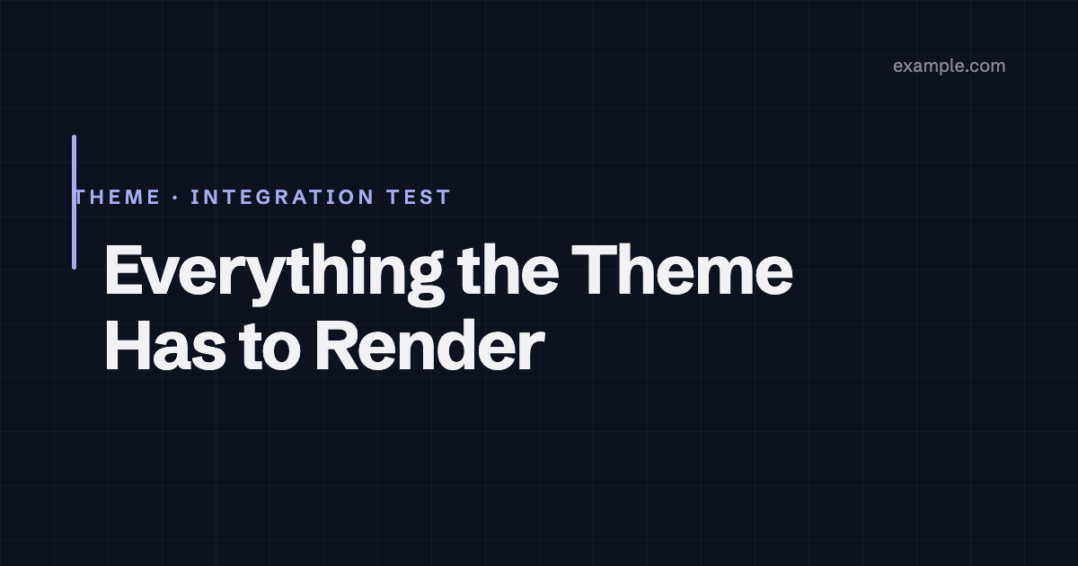
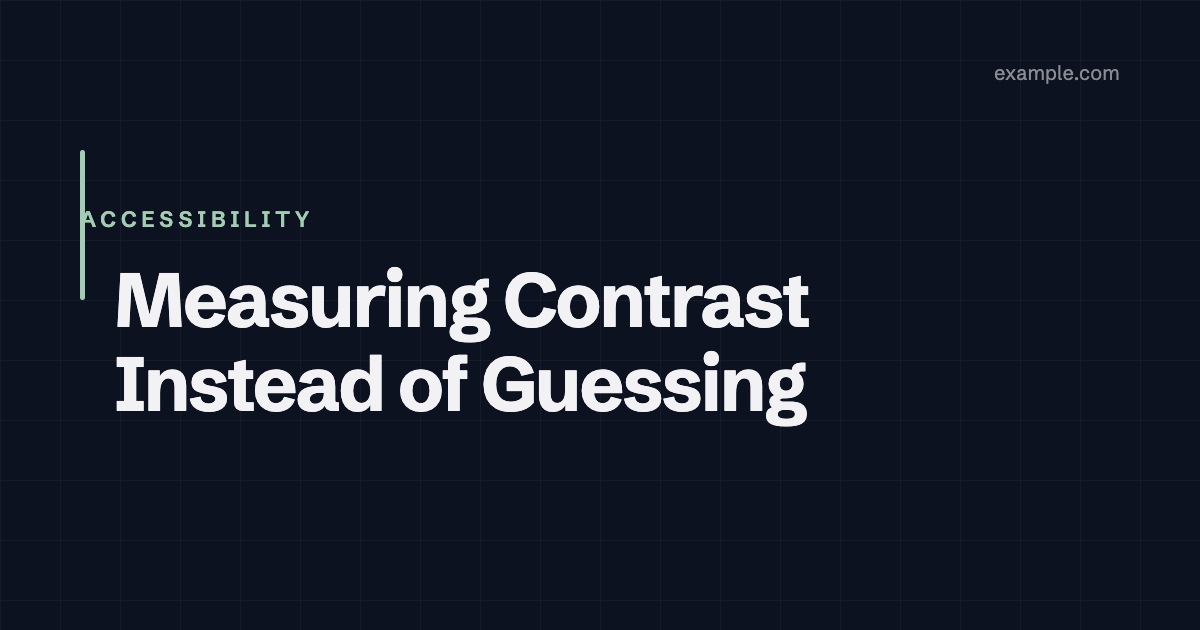
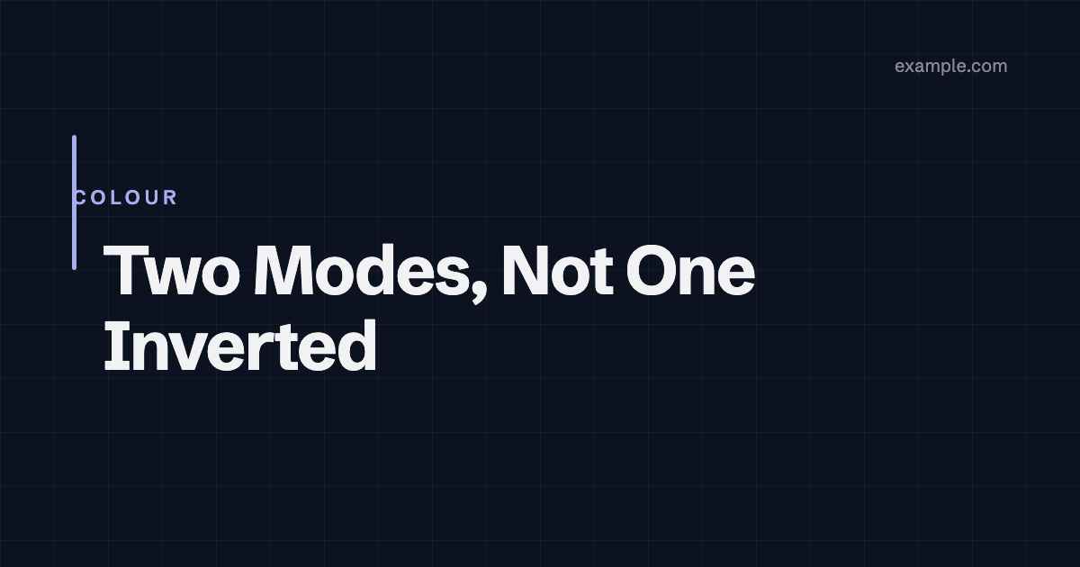
Nothing moves on its own, and there is no JavaScript. It is native scroll-snap. That
matters more than it sounds: an autoplaying carousel owes the reader a pause control and
fights prefers-reduced-motion, and a scripted one stops working when the script does.
This one scrolls, snaps, takes keyboard focus and works with scripting off, because the
browser is doing all of it.
Like gallery, it has no image handling of its own — it scrolls nested
figure shortcodes, so there is one image path in the theme rather than two.
Reach for a gallery when the images are a set the reader should see at once, and this when
they are a sequence.
typeit#
Text typed out when it scrolls into view.
{{< typeit >}}This sentence types itself.{{< /typeit >}}This sentence types itself.
The finished text is in the markup, and the script removes it to retype it. So the
fallback is not really a fallback: with JavaScript off, or under prefers-reduced-motion,
the sentence is simply already there and complete. A typewriter effect is motion with no
information in it, so a reader who asked for less of it should lose nothing — and does not.
While it types, the element is aria-hidden: a screen reader announcing a partial sentence
on every character is worse than useless. The finished text is announced once, at the end.
There is no library behind this. The obvious one is GPL-3.0 and this theme is MIT, so
vendoring it would push every site using the theme onto a copyleft licence for the sake of
a decorative animation. The effect is about twenty lines and lives in
assets/js/typeit-init.js.
oembed#
A rich card for any URL whose provider publishes an oEmbed endpoint.
{{< oembed url="https://vimeo.com/76979871" endpoint="https://vimeo.com/api/oembed.json" >}}The html field is deliberately not used. That is the field oEmbed exists to deliver,
and it is almost always a third-party iframe or script — exactly what this theme does not
put on a page. What is rendered instead is the metadata: title, author, provider, and the
thumbnail, which is downloaded at build time and served from your own domain rather
than hotlinked.
So this is a facade, on the same terms as youtube-lite: it looks like the thing, links to
the thing, and loads nothing until the reader chooses to go there.
endpoint is required and there is no discovery step. Discovery means fetching the page
first to read a <link> out of it — two requests to learn something the author already
knows.
codeimporter and mdimporter#
Pull a file from a URL at build time: codeimporter renders it as a code block,
mdimporter renders it as Markdown into the page.
{{< codeimporter url="https://example.com/main.go" type="go" lines="1-20" >}}
{{< mdimporter url="https://example.com/shared/notice.md" >}}
Same terms as the repository cards: the reader fetches nothing, the content is baked in
during the build, and a failed fetch degrades to a link rather than failing an offline
build. lines takes an inclusive range counted from 1, and out-of-range bounds are clamped
rather than erroring — a file that grew is not a reason to break somebody’s build.
Caution
mdimporter renders somebody else’s content as your own, including any raw HTML in
it if your site allows that. Point it at something you control.
gist#
A GitHub Gist, fetched at build time and rendered as an ordinary code block.
{{< gist user="octocat" id="6cad326836d38bd3a7ae" >}}class HelloWorld
def initialize(name)
@name = name.capitalize
end
def sayHi
puts "Hello #{@name}!"
end
end
hello = HelloWorld.new("World")
hello.sayHiThe reader requests nothing. The usual Gist embed is a third-party script that runs on page view; this reads the Gist during the build, so what arrives is a code block that gets this theme’s own syntax highlighting rather than GitHub’s stylesheet — and it looks right in both colour modes, which an embedded Gist does not.
file picks a file when the Gist has several; the first is used otherwise. A deleted Gist
warns and fails the gate; being offline degrades to a plain link, on the same terms as the
repository cards.
Repository cards#
A card for a repository, with its description and counts read at build time.
{{< github repo="gohugoio/hugo" >}}Seven forges share one mechanism: github, gitlab, codeberg, gitea, forgejo,
huggingface and ansible. The Gitea-family three take a host for a self-hosted
instance.
The reader fetches nothing. The numbers are baked into the HTML during the build, so a card costs a visitor no third-party request at all — which is the whole reason this is a build-time fetch rather than a script.
The build does fetch, and that is the trade. Two things follow, and both are handled rather than hoped about:
- Nothing is requested unless a page actually uses one of these, so a site that does not still builds with no network access at all.
- A failed fetch is not a build failure. Offline, rate-limited, renamed or deleted, the
card degrades to a plain link with the repository’s name — the useful part — and the
build carries on. It does warn, and
make checkturns warnings into failures, so a broken card fails CI where someone can fix it rather than rotting quietly.
Hugo caches the responses, so a rebuild does not re-fetch and a forge’s rate limit is not
hit once per build. hugo --gc clears the cache.
chart#
A chart drawn from data, using Chart.js.
{{< chart alt="Build time in seconds, falling from 42 to 9 over five releases" >}}
{
  "type": "line",
  "data": {
    "labels": ["0.1", "0.2", "0.3", "0.4", "0.5"],
    "datasets": [{ "label": "Build time (s)", "data": [42, 31, 22, 14, 9], "tension": 0.3 }]
  }
}
{{< /chart >}}| Parameter | Required | What it does |
|---|---|---|
alt | yes | What the chart shows, in words |
ratio | no | The box, as W/H. Default 16/9 |
caption | no | Figure caption, rendered as inline Markdown |
alt is required and the build fails without it. A <canvas> is a picture to
everything that is not a sighted reader — a screen reader, a text browser, a feed — so a
chart with no text alternative is a chart most of your readers cannot read at all.
Describe the shape and the point, not the mechanics: “falling from 42 to 9 over five
releases” is useful, “a line chart” is not.
Reach for a table first. A table is readable by everything, sorts, copies, survives with JavaScript off and needs no library. Use a chart when the shape of the data is the point and the numbers are not.
The body is Chart.js configuration as JSON, and it is parsed at build time — malformed
JSON fails the build with a position rather than rendering an empty rectangle nobody
notices. It reaches the browser on a data- attribute rather than in an inline script, so
a site running a strict Content-Security-Policy is unaffected.
Colours come from the palette. A dataset with no colours of its own gets the accent, so
a chart looks like the rest of the site rather than like Chart.js; set them in the config
and yours are kept. Charts follow the colour mode, and the entry animation is dropped
entirely under prefers-reduced-motion.
Like mermaid, the library is loaded only on pages that use this and never from the
shared bundle. It is self-hosted and fingerprinted; nothing is fetched from a CDN.
mermaid#
A diagram written as text, rendered in the browser.
{{< mermaid >}}
graph LR
  A[Markdown] --> B{Shortcode?}
  B -->|no| C[Render hook]
  B -->|yes| D[Theme syntax]
  C --> E[Portable]
  D --> F[Theme-specific]
{{< /mermaid >}}
graph LR
A[Markdown] --> B{Shortcode?}
B -->|no| C[Render hook]
B -->|yes| D[Theme syntax]
C --> E[Portable]
D --> F[Theme-specific]The library is only loaded on pages that use this. Mermaid is 3.5MB — more than the rest of the theme’s assets put together — so the script is gated on the page actually containing a diagram. Every other page on this site loads none of it. It is self-hosted and fingerprinted like every other asset here; nothing is fetched from a CDN.
With JavaScript off you get the diagram’s source, in a code block, because that is
what the shortcode emits and the script replaces it in place. For a flowchart or a
sequence diagram that text is genuinely readable — A --> B says what it means — which is
why the fallback is the source rather than an empty box.
The diagram follows the colour mode. Mermaid bakes its palette into the SVG it generates,
so switching modes re-renders from the source rather than restyling what is there; the
theme’s own northlight:appearance event is what triggers it.
Inner content is taken raw rather than rendered as Markdown. Diagram syntax is full of
characters Goldmark would otherwise treat as markup — -->, |, #, underscores — and a
diagram quietly reformatted into emphasis is a bug with no error message.
A diagram with a syntax error renders mermaid’s own error in place rather than taking the page down. That is more use to whoever wrote it than a blank space.
video#
A self-hosted video player. The file is yours, so nothing here contacts another host.
{{< video src="clip.mp4" poster="clip.jpg" caption="Eight seconds of north light" >}}| Parameter | Required | What it does |
|---|---|---|
src | yes | The video, a page resource or assets/ path |
poster | no | A still shown before play. Strongly recommended |
caption | no | Figure caption, rendered as inline Markdown |
ratio | no | The box, as W/H. Default 16/9 |
controls | no | Player controls. Default true |
loop | no | Restart on end. Default false |
muted | no | Start muted. Default false |
preload | no | none, metadata or auto. Default metadata |
start | no | Seek to this many seconds on load |
end | no | Stop at this many seconds |
There is deliberately no autoplay. CSS cannot stop playback, so honouring
prefers-reduced-motion would take JavaScript, and every script in this theme has to
degrade to something sane when scripting is off. An autoplay that quietly ignores a
reader’s stated preference whenever JS is unavailable is not a promise the theme can
keep, so the parameter does not exist rather than existing and being unreliable.
The box is an exact aspect-ratio, so it reserves its space before any video arrives and
the page does not shift when the metadata lands. A clip whose own ratio differs from the
box letterboxes rather than crops, on the same never-crop terms as covers and galleries.
Without a poster the player paints a flat rectangle until the first frame decodes. That
is layout-shift-free but ugly, which is why the parameter is recommended rather than
merely available. A browser that cannot play the file gets a download link, so it can
hand the video to something that can.
youtube-lite#
A YouTube embed that contacts nobody until the reader asks it to.
{{< youtube-lite id="aqz-KE-bpKQ" poster="shot-c.png" alt="Video still" >}}| Parameter | Required | What it does |
|---|---|---|
id | yes | The YouTube video id |
poster | yes | A still from your own site — a page resource or assets/ path |
alt | no | Alt text for the still |
This is a facade, and the point is what does not happen. An ordinary YouTube embed is a third-party request that every reader pays on page view, whether or not they ever press play. What loads here is your own poster image, a play badge and a link. Nothing reaches a Google host until the click.
The poster has to be a local file. Pulling the thumbnail from ytimg.com — which is how
most “lite” embeds do it — is itself a third-party request on page view, so a facade that
does that is not a facade.
With JavaScript off it stays a link and opens the video on YouTube. That is the honest
fallback; the alternative is a play button that does nothing. With JavaScript on, the
click swaps in a youtube-nocookie.com player in place.
tabs#
Tabbed panels, for showing variants of the same step.
{{< tabs group="install" >}}
{{< tab label="Submodule" >}}
`git submodule add …`
{{< /tab >}}
{{< tab label="Hugo Module" >}}
`hugo mod init …`
{{< /tab >}}
{{< /tabs >}}
Submodule
No Go toolchain needed, which is why it is the recommended route.
git submodule add https://github.com/you/northlight themes/northlightHugo Module
Needs Go available wherever you build.
hugo mod init github.com/you/your-site| Parameter | On | Required | What it does |
|---|---|---|---|
group | tabs | no | Sets sharing a group switch together across the page |
label | tab | yes | The tab’s name |
icon | tab | no | An icon before the label |
Turn JavaScript off and this page still works. What the server sends is not a tab
strip: it is a plain sequence of headed sections, every panel visible one after another,
each under its own heading. That is a complete document. The script then upgrades it in
place into a real tablist, with role="tablist", aria-selected, aria-controls and
arrow-key navigation, and hides the headings once the tab buttons carrying the same text
exist.
Built the other way round — shipping a tab strip and using script to make it usable — a reader without JavaScript gets a stack of unlabelled boxes. This is the reason the heading is in the markup at all.
Sets sharing a group switch together, so a page documenting two steps of the same choice
does not make you pick twice. This second set is in the same install group as the one
above; switch either and both move:
Submodule
Remember submodules: recursive on your CI checkout step.
Hugo Module
No checkout flag needed; the module is fetched at build time.
gallery#
A responsive grid of images.
{{< gallery cols="3" >}}
{{< figure src="shot-a.png" alt="Hello Northlight cover" >}}
{{< figure src="shot-b.png" alt="Measuring cover" >}}
{{< figure src="shot-c.png" alt="Two modes cover" >}}
{{< /gallery >}}| Parameter | Required | What it does |
|---|---|---|
cols | no | 2 or 3 columns on a wide screen. Default 3 |
It has no image handling of its own. It grids whatever figure shortcodes
you nest inside it, so a gallery image gets the same srcset, intrinsic dimensions, dark
variants and captions as any other, and there is no second code path to keep in step.
Nothing is cropped. Every other image grid you have met crops to a uniform box with
object-fit: cover, and that is exactly what this theme cannot do — a cover is 1200×630
with its title inside the artwork, so a crop destroys it. The grid sizes columns and lets
rows be as tall as their content. The images above are all the same shape, which is a
property of these files rather than something the grid imposed.
Columns reflow on the grid’s own width rather than at a guessed breakpoint, and collapse to one column when there is no room.
timeline#
A vertical sequence of dated entries.
{{< timeline >}}
{{< timelineItem header="0.2.0" subheader="27 July 2026" badge="Release" >}}
Sharing links, nested menus and the search index.
{{< /timelineItem >}}
{{< timelineItem header="0.1.0" subheader="20 July 2026" icon="check" >}}
First tagged release.
{{< /timelineItem >}}
{{< /timeline >}}
0.2.0 Release
27 July 2026
Sharing links, nested menus and the search index.
0.1.0
20 July 2026
First tagged release.
| Parameter | Required | What it does |
|---|---|---|
header | yes | The entry’s title |
subheader | no | A line beneath it, usually a date |
badge | no | A short label, using the same chip as badge |
icon | no | An icon for the marker. Defaults to a plain dot |
The marker is a dot unless you give it an icon, because a column of identical icons carries no information and the sequence is the point. The connecting line stops at the last entry rather than trailing off below it.
accordion#
A set of collapsible panels.
{{< accordion >}}
{{< accordionItem title="Does this need JavaScript?" open="true" >}}
No. It is `<details>` and `<summary>`.
{{< /accordionItem >}}
{{< accordionItem title="What about opening one at a time?" icon="info" >}}
Set `single="true"` on the container.
{{< /accordionItem >}}
{{< /accordion >}}
Does this need JavaScript?
No. It is <details> and <summary>, so it opens, closes and takes keyboard focus
without a line of script. Turn JavaScript off and it still works.
What about opening one at a time?
Set single="true" on the container. That is a shared name on the <details>
elements, which browsers handle natively.
| Parameter | On | Required | What it does |
|---|---|---|---|
single | accordion | no | Opening one panel closes the others. Default false |
title | accordionItem | yes | The summary text |
icon | accordionItem | no | An icon before the title |
open | accordionItem | no | Render this panel already expanded. Default false |
No JavaScript, and not as a fallback. The whole thing is <details>/<summary>, so
opening, closing, keyboard operation and the accessibility tree all come from the element
itself. single is a shared name attribute, which browsers implement natively; one too
old to support it simply lets several panels stay open, which is a mild degradation rather
than a broken control.
With single, opening one panel closes the others:
First
Opening the second one closes this.
Second
And opening the first closes this.
figure#
An image with a caption, and optionally a link.
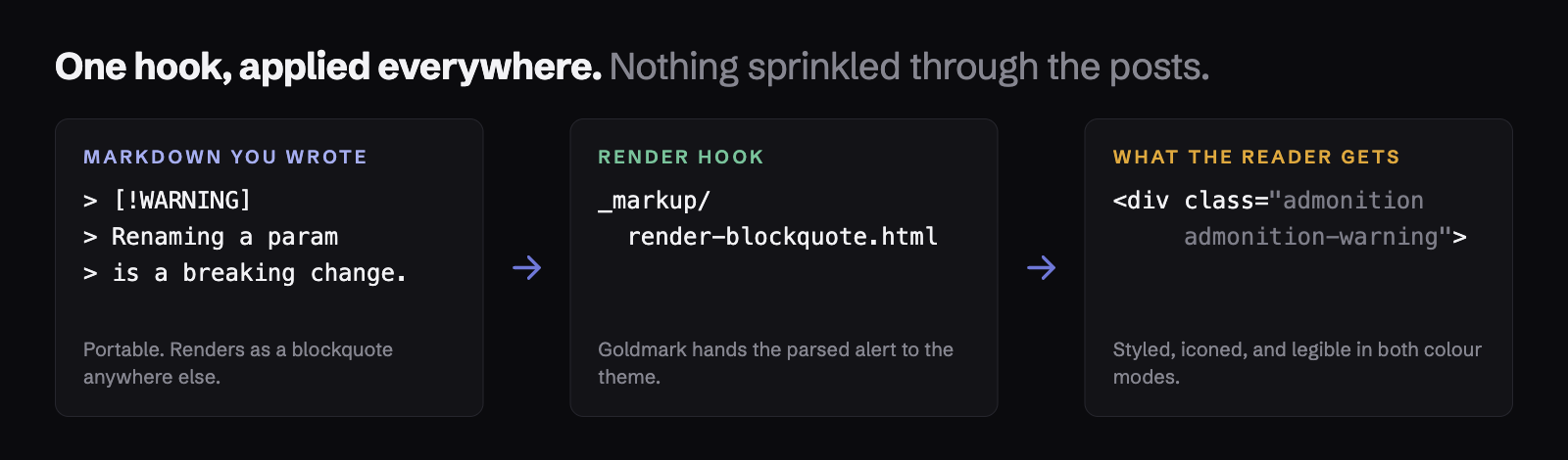
Reach for this only for what Markdown cannot say. 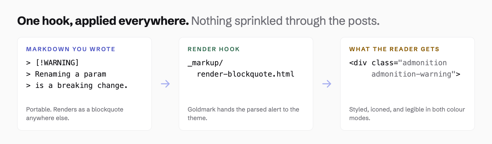 is a
render hook, renders fine under any theme, and is the better answer wherever it fits. This
exists for a figure that is also a link, or one that needs a class.
{{< figure src="diagram.png" alt="The render hook pipeline"
        caption="The same image, through the same pipeline as a Markdown image"
        href="/docs/writing/" >}}
| Parameter | Required | What it does |
|---|---|---|
src | yes | A page resource, or a path under assets/ |
alt | no | Alt text. Pass alt="" deliberately for a decorative image |
caption | no | Caption text, rendered as inline Markdown |
href | no | Wraps the image in a link |
class | no | An extra class on the <figure> |
It goes through the same srcset, sizes, width and height machinery as a Markdown
image, so it reserves its box before the bytes arrive and costs a phone the same bytes a
Markdown image would. It is never cropped: only widths are generated, never a fixed
box, so a 1200×630 cover with its title baked into the artwork survives intact.
Dark variants work here too. Drop diagram-dark.png beside diagram.png and it is
used whenever the dark palette is active — the image above is doing exactly that, so
switch the colour mode and watch it change. Without that, a diagram baked at one
brightness is a bright slab in the other mode, and this theme treats dark mode as
first-class rather than as an inversion.
A src that resolves to nothing fails the build rather than rendering a broken image icon.
alert#
A callout box.
{{< alert type="warning" >}}
Renaming a published config key is a breaking change.
{{< /alert >}}
Warning
Renaming a published config key is a breaking change.
| Parameter | Required | What it does |
|---|---|---|
type | no | note, tip, important, warning or caution. Default note |
icon | no | An icon name, overriding the one the type implies |
title | no | Heading text, overriding the type name |
Prefer > [!NOTE] where it fits. Admonitions already ship as a render hook over
GitHub’s alert syntax, described on Writing content, and this
shortcode reuses that exact CSS rather than introducing a second callout style. A callout
written either way is the same box.
Three things the blockquote syntax cannot do, which are the whole reason this exists — a custom icon, a custom title, and a callout nested inside another shortcode:
Reviewed
This one sets its own icon and its own title.
An unknown type fails the build rather than falling back to note. A misspelled
warning rendering as a neutral note is a callout quietly saying the wrong thing, which is
worse than one that does not build.
article#
Embeds one post as a card, given its path.
{{< article link="/blog/hello-northlight" >}}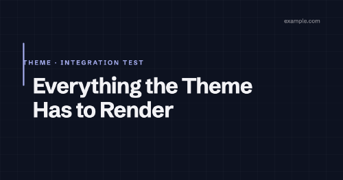
| Parameter | Required | What it does |
|---|---|---|
link | yes | Path to the page, as ref understands it |
The card is the same one the home page and taxonomy pages use, so an embedded post cannot drift away from a listed one. The cover renders at its exact aspect ratio, and a draft, an external link post or a post with no cover all behave here as they do in a listing.
A path that resolves to nothing fails the build. The alternative is a card with no title linking nowhere, which reads as a styling bug rather than a broken reference and survives every review, including the one where somebody renames the post it pointed at.
list#
Embeds recent posts, using the same row the post index uses.
{{< list limit="2" >}}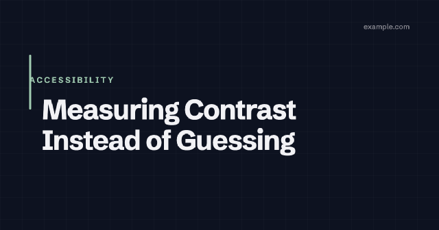
Measuring Contrast Instead of Guessing
Four of the theme's own syntax colours failed the 4.5:1 floor. All four had been calculated by hand and looked fine.
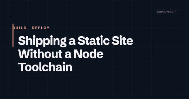
Shipping a Static Site Without a Node Toolchain
Hugo's asset pipeline covers concatenation, minification and fingerprinting on its own. A third post, so related content has more than one candidate to choose from.
| Parameter | Required | What it does |
|---|---|---|
limit | no | How many to show. Default 3 |
title | no | A heading above the list |
where | no | A taxonomy to filter on, such as tags |
value | with where | The term to match within that taxonomy |
Filtered to one term, with a heading:
{{< list where="tags" value="example" title="More on this" limit="2" >}}Shipping a Static Site Without a Node Toolchain
Hugo's asset pipeline covers concatenation, minification and fingerprinting on its own. A third post, so related content has more than one candidate to choose from.
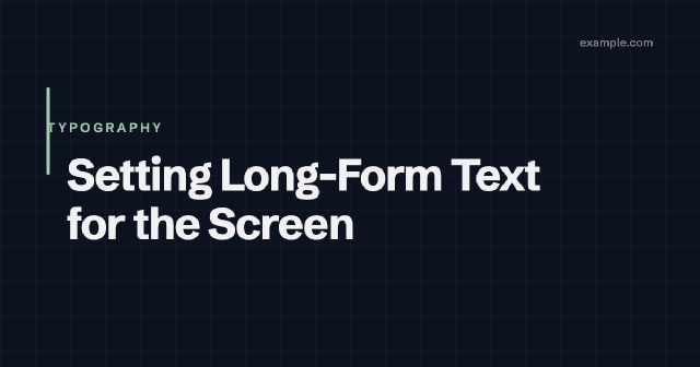
Setting Long-Form Text for the Screen
Measure, leading and scale are the whole job. A second post so prev/next, related content and the post index have something real to work with.
Posts come from mainSections, so this lists what your site calls posts rather than every
page in the build.
Heading levels are chosen so the block nests wherever you put it. A page’s own sections
are h2, so the items are h3; given a title, that becomes the h3 and the items drop
to h4. Left at the level the post index uses, the items would read as ending the
section they sit inside, which matters to anyone navigating by heading.
where and value go together, and each without the other fails the build. So does a
filter that matches no posts: an empty result renders as nothing at all, which is
indistinguishable from having forgotten the shortcode, and it is almost always a typo or a
term that was renamed out from under the reference.
keyword and keywordList#
A wrapping row of labelled pills, for a set of things listed together: the stack behind a project, the topics a post covers, the tools a piece of work used.
{{< keywordList >}}
{{< keyword icon="github" >}}Open source{{< /keyword >}}
{{< keyword >}}Hugo{{< /keyword >}}
{{< keyword >}}No JavaScript framework{{< /keyword >}}
{{< /keywordList >}}
Open source Hugo No JavaScript framework
| Parameter | Required | What it does |
|---|---|---|
icon | no | An icon name from the icon set, shown before the label |
A keyword deliberately shares a shape with badge, because both are small
labels and a reader should not have to learn two visual languages for that. They are not
interchangeable though: a badge marks one thing inside a sentence, a keyword is one of a
set. Neither is a tag — tags carry link behaviour and a taxonomy behind them.
The inner text is required. An icon on its own would be a pill whose meaning the reader has to guess, so leaving the label out fails the build rather than rendering it.
The row wraps at narrow widths rather than scrolling.
icon#
Puts one of the theme’s inline SVG icons into your content.
Built with {{< icon "github" >}} and hosted anywhere.Built with and hosted anywhere.
No size parameter, and none is needed: an icon is 1em square, so it takes the size of
whatever text it sits in and follows body copy, a heading or a caption without being
told. Colour comes from currentColor for the same reason.
The full set#
These names are the whole set, and they are a stable surface — the theme treats renaming one as a breaking change, the same as renaming a config key.
github | linkedin | reddit | rss |
mastodon | bluesky | hackernews | email |
x | facebook | telegram | whatsapp |
pinterest | link | external | search |
pencil | arrow-left | arrow-right | arrow-up |
chevron-down | moon | sun | copy |
check | info | bulb | megaphone |
alert | octagon | underline | zen |
eye | heart | zoom-in | zoom-out |
zoom-reset |
alert, octagon, info, bulb and megaphone are the admonition marks, and they are
drawn to be told apart by outline alone rather than by the colour beside them. The three
zoom- marks are the lightbox controls, and share one lens so they read as a set.
A name that is not on this list fails the build rather than rendering an empty gap.
The icon is marked aria-hidden, which is right for what it is: decoration next to a
word. There is no parameter for a text alternative, deliberately. An icon that carries
meaning on its own needs the word written next to it, and an icon whose meaning a reader
has to guess is a problem for sighted readers too.
Both set a dir attribute rather than a CSS direction property, which is the part
worth understanding. dir is real HTML, not a styling convention: it drives the
bidirectional algorithm, text alignment, list markers and punctuation placement all at
once, and it keeps working in a reader-mode view or a feed reader that has thrown the
stylesheet away. A CSS property would only handle the first of those, and only while the
stylesheet loads.